a nice attempt a trying modern design, but in my eyes, there are a few flaws i cannot get over such as all those interior trims, funny overhangs and elevations that looks like 2 different houses.
http://sothebysrealty.ca/en/property/british-columbia/greater-vancouver-real-estate/burnaby/45648/
 ‘let’s just throw every idea into one house’ the designer must have thought. the front of the house looks like this but…
 this is the side of the house. i do wish they would have framed out the jog above the 1st storey window to create a nice straight line for the overhang. pet peeve of mine : the railing for the sunken patio bumps up against the window of the living room.
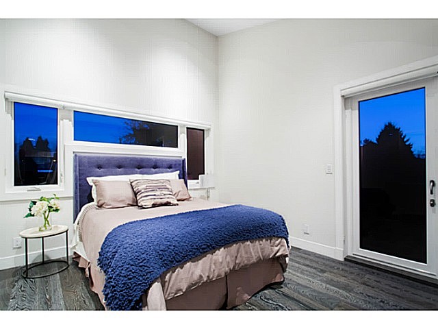 so there is more ceiling height in the bedroom with the C-shaped window. why not move this window up of make it bigger? seems odd to me.
so is this still worth of a goodie title or should be toss it into the eyersore heap?

I enjoy your blog David, and I thank you for the emailed posts. As a fan of modern architecture and a detester of pseudo craftsman, it nice to see the resurgence of clean lines and minimalism in design. Unfortunately builders and developers and contractors(oh my) that think they have an eye for design, will “Mike Holmes” the modernism.
You watch just how bad it’s going to get. A flat roof here, giant windows there, a dash of hyper minimalism and bingo! Welcome to bland-ville.
Jim, you are so right. There is no quick formula for successful modern home design. Every successful home has to take into consideration so many things : materiality, light, massing, views, space, and on top of that the way the homeowners will live in the home.
Thanks for reading!
Totally awful mish-mash.